Training Evaluation: Measure What Matters
This project is a modern reimagining of a microlearning course I originally created for colleagues a few years ago. In this updated version, I applied current best practices in instructional design, focusing on engagement, clarity, and real-world application, to demonstrate how I would approach the same challenge today.
Audience: Training Specialists (new to training evaluation)
Responsibilities: Course Design, Storyboarding, Visual Design, eLearning Development
Tools Used: Articulate Storyline 360, Figma
The Problem
In 2023, I created a microlearning course for colleagues in the Training Unit at USAID to introduce the Kirkpatrick Model of Evaluation. Although the content was well‑received, the experience never matched my vision:
It was built in an older version of Adobe Captivate, and the UI looked dated.
The design was top‑down and lecture‑heavy, more tell than show.
The so‑called “scenarios” were essentially knowledge checks; learners weren’t making authentic decisions.
I wanted to transform that static overview into a true scenario‑based experience, one that feels modern, invites exploration, and lets learners practice choosing the right evaluation method rather than just recalling definitions. A design challenge with a prospective employer provided the perfect opportunity to reimagine that training. With time to rethink and rebuild, I set out to create the course I had always imagined, this time in Articulate Storyline.
The Solution
I re‑engineered the lesson into a compact Storyline module that swaps lecture for lived experience:
Day‑in‑the‑Life Narrative – Learners step into the shoes of a training professional fielding real stakeholder questions throughout the workday.
Decision‑Driven Scenarios – Each stakeholder challenge asks, “How would you measure this?” Learners choose an action (survey, knowledge test, on‑the‑job observation, business‑impact analysis) and receive immediate, contextual feedback.
Mentor on Call – An optional mentor button offers hints, scaffolding novices without interrupting confident learners.
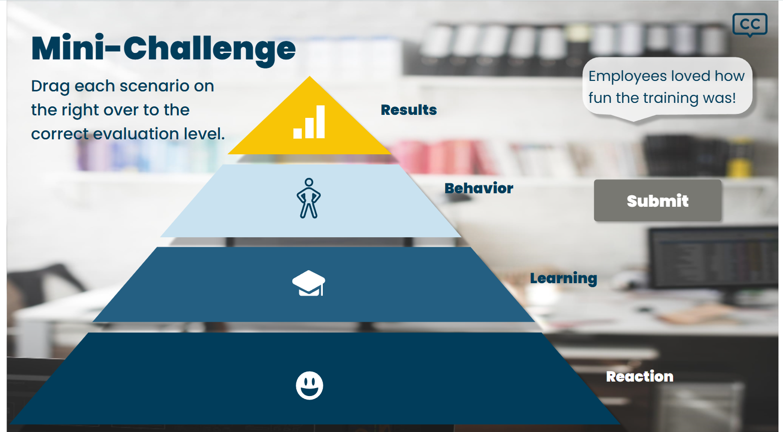
Rapid‑Fire Drag‑and‑Drop Finale – A final classification challenge reinforces the four levels by having learners match mini‑cases to the Kirkpatrick pyramid.
Modern Visual & UX Polish – Built in Articulate Storyline, the course features clean UI, iconography, and subtle motion to create a contemporary feel without bloating load times.
The result is a concise, scenario‑based experience that lets learners practice picking the right evaluation method and see why each choice matters, inside of seven engaging minutes.
My Process
Reflect on the 2023 Captivate Version
I no longer had access to the original file—my work laptop was returned when I was laid off—so I relied on memory (and a few screenshots) to recall what worked (succinct content) and what fell flat (dated visuals, lecture‑heavy delivery, quiz‑style “scenarios”).
Reframe the Learning Challenge
I thought, “If a busy L&D specialist had only a few minutes, how could they apply (not just recall) the Kirkpatrick model?”
I defined a single objective: Analyze stakeholder concerns and recommend the best evaluation method.
Storyboard a Scenario Spine
Sketched a “day‑in‑the‑life” arc: three escalating stakeholder requests , optional mentor hints, rapid‑fire drag‑and‑drop recap.
Planned slide layers and triggers up‑front to keep development under ten slides.
Prototype & Iterate in Storyline
Built visual mockups in Figma, and then a rough prototype in Storyline.
Gathered quick feedback from two former USAID colleagues on pacing, clarity, and mentor utility.
Refined copy, streamlined interactions, and updated iconography for a modern, accessible look.
Polish & Publish
Added subtle animations and ensured WCAG‑friendly color contrasts.
Deployed to AWS S3 for fast, link‑based sharing.
By re‑imagining the lesson from memory, and leveraging modern tools plus a scenario‑based approach, I delivered the engaging, practice‑first experience the topic always deserved.

Storyboard
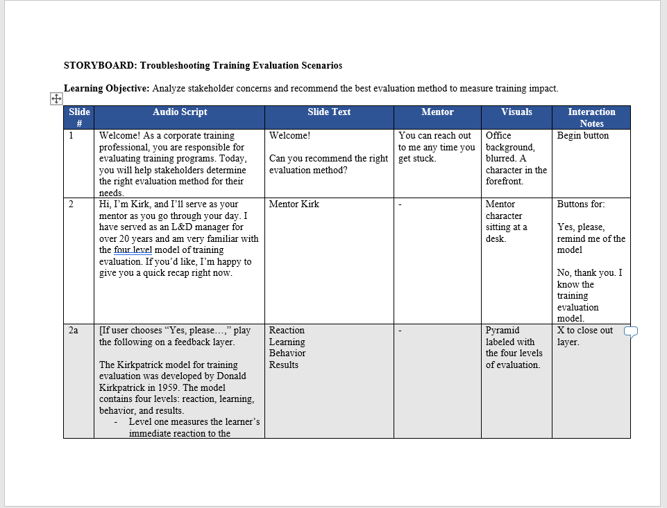
I created a streamlined storyboard in Word that mapped every slide’s audio, on‑screen text, mentor hint, visuals, and interaction notes in one view. This single‑source blueprint kept development tight, under ten slides, and let stakeholders preview flow, tone, and accessibility features before I worked out the variables and triggers in Storyline.


Keeping to the personalization principle, I kept the language conversational throughout and chose a mentor character to guide the learner through the entire experience. The learner could click on the mentor character at any time to receive assistance on-demand, thus driving home the idea that this was meant to be a learner-driven learning experience instead of a test for the learner to pass.
Visual Mockups
I built high‑fidelity visual mockups in Figma to lock down layout, color, and iconography before development. My design choices aimed to:
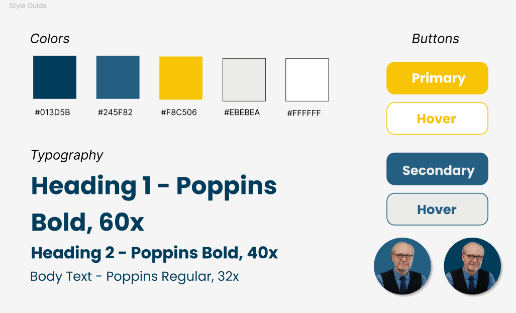
Modernize the Look – Flat icons, generous white space, and Storyline‑friendly fonts (Poppins) give the course a fresh, app‑like feel that is worlds away from the archaic Captivate version.
Guide Attention – A muted palette keeps focus on interactive elements, while accent blues and teals highlight calls to action and the mentor avatar.
Echo the Model – The Kirkpatrick pyramid appears as a crisp, four‑tier graphic that doubles as a drag‑and‑drop target, visually reinforcing hierarchy without extra explanation.
Ensure Accessibility – All colors meet WCAG AA contrast; interactive states use both color and shape changes for learners with color‑vision deficiency.
Photorealistic Characters – I selected clean, photorealistic cut‑out characters rather than illustrated ones. Because the scenarios mirror real workplace conversations, lifelike figures help learners project themselves into the situations, reinforcing authenticity and adult‑learning relevance while still blending seamlessly with the flat‑icon UI.
These mock‑ups served as a visual contract, ensuring stakeholder alignment and speeding up Storyline development because every asset was pre‑approved and ready to import.

Next, I created mockups of each type of slide - a title slide, a mentor slide, a question slide, a consequence slide, etc - to solidify the layout, and then iterated on the design.

Full Development
I had a limited amount of time to develop this training, so I jumped right into developing once the storyboard and visual mockups were complete. The original intention was for the scenarios to appear as emails on a computer, but I struggled sourcing multiple computer graphics that aligned visually with the other visual assets, and gave up on the idea. (Looking back, this is what I would change from this training - the scenarios as they stand feel more like quiz questions than genuine immersion. The other item I would change is the feedback for the answers - I wish I had more time to build out true branching where each choice leads the user down a path as opposed to the binary right and wrong.)

What I did use much of my limited time for was to build in a mentor character that allowed for on-demand learner support. It was important to me that the learner had full control over this support - that it could be called upon as needed, but closed out if the learner decided they didn’t need it after all. This is one way I get around forced navigation that many stakeholders ask for. There’s the required slides, and then there’s the learner support layers, which allow for autonomy.
Results and Takeaways
Results
The final project received positive feedback from the hiring team, particularly highlighting my ability to narrow the scope effectively and maintain a strong learner-centric approach. Personally, I achieved key wins by transitioning seamlessly back to Storyline 360 after several years of primarily using Captivate. I also proactively taught myself Figma to create polished visual mockups for the challenge. Despite the tight timeline, I delivered a complete, functional prototype that aligned with the project goals and maintained a clean, user-friendly design.
Key Takeaways
This project reinforced the importance of strategic prioritization under tight deadlines. Although I initially envisioned more intricate visual elements, such as displaying scenarios through a simulated email interface, I ultimately chose to focus my limited time on enhancing the learning experience itself by adding an additional practice activity (a drag-and-drop interaction). The experience strengthened my ability to make smart design trade-offs, work efficiently under pressure, and quickly upskill with new tools when needed.
